Artificial intelligence can do amazing things, but in many cases, we have no idea how those systems make their decisions. The lack of visibility, transparency and usability inherent to foundational AI technologies is often attributed to the nature of the AI “black box” — or how models can only be evaluated by their outputs.
While open-source projects like Hugging Face allow anyone interested in AI to experiment with the raw material that goes into creating a model, interfaces between non-engineer users and those models are virtually nonexistent. Most rely on a command line as the primary means of interaction, further exacerbating the problem as it is itself a black box or rectangle—no other cues to how to use it.
Why are we not seeing more experimentation around ways to directly interact with, tweak, and manipulate how models produce their outputs? The more critical or cynical part of me believes that current interfaces are intentionally designed to be magical versus functional or malleable. It’s in the company’s best interest to say, “Trust us, our models are special. No need to look under the hood!”
Why the AI Black Box needs windows
Brute-force prompt engineering and iteration shouldn’t be a user’s only options for coaxing the right outputs from the models. There has to be a better interaction model than trial-and-error to identify and correct potential problems within AI technologies — problems like biases or ethical quandaries that result in undesirable outcomes.
To illustrate the problem, I looked away from the command line and focused on algorithmically generated radio stations on music streaming services. These features are powered by machine learning, which was once the cutting edge of AI.
Generated radio stations are not new, so you would hope their design has evolved. But that hasn’t been the case.
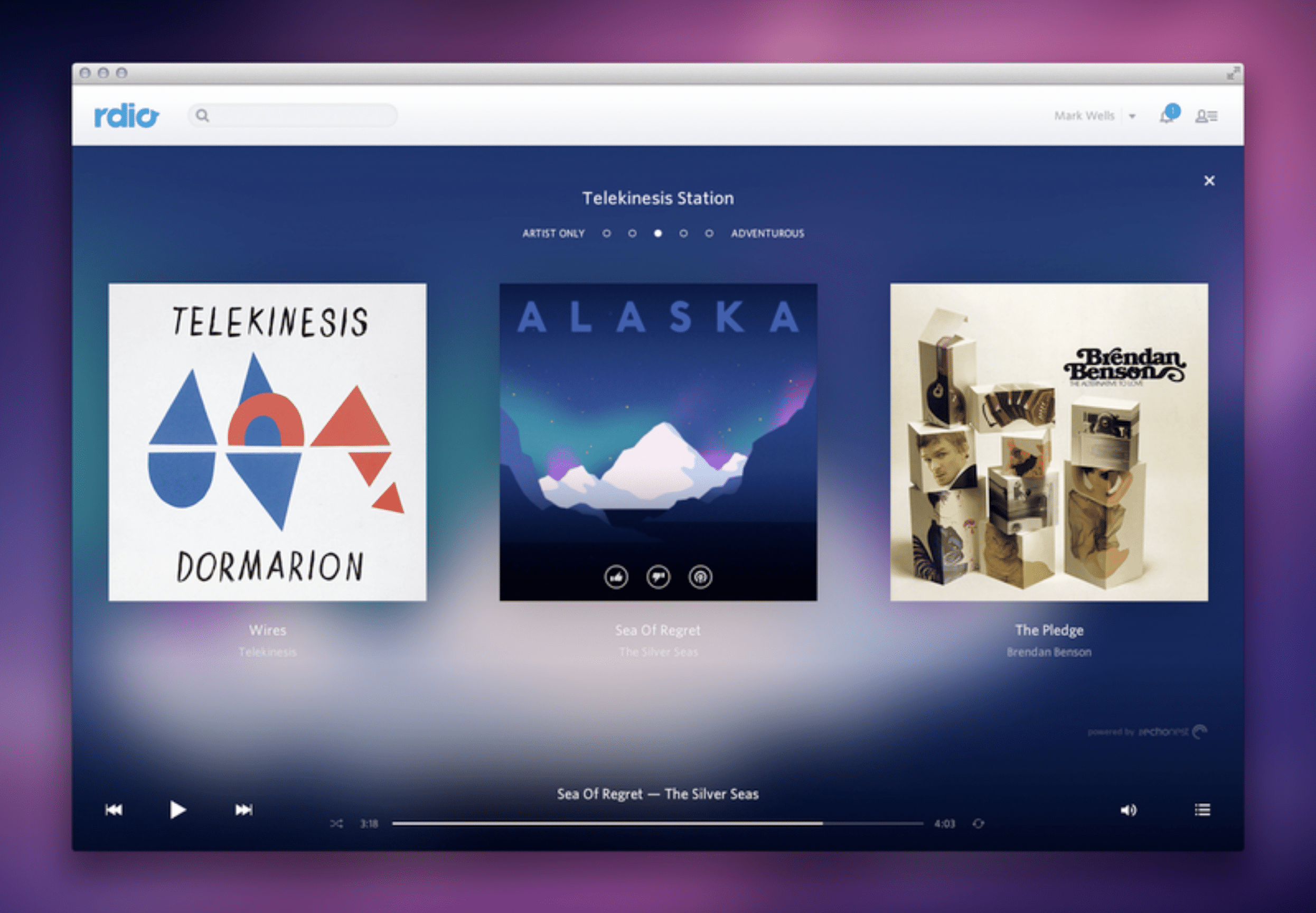
There was some experimentation early on. When Rdio was around, the streaming service had a rather unique (even to this day) way of allowing users to generate radio stations directly by tuning them across a spectrum of “Artist only” to “Adventurous.” As simple as it is, it’s a good example of a foregrounded parameter from the underlying personalization engine. It’s a small window into what’s happening.
Sadly, the feature died with the business, and no one else has copied or built on it.

After a decade in the market, these stations are common to all streaming services. But rather than being a creative navigation tool for seemingly infinite music libraries, we’re limited to formulaic “set it and forget it” features. There are no other levers to pull, constraints to add, parameters to tune, or feedback to give. Spotify only offers the ability to “heart” a song when playing a generated station, which is a data point, but for the future. It will do nothing for the currently playing station.
I can only conclude that the parameters and rules driving these stations are rendered to be intentionally opaque. Rdio proved that it is possible to give listeners some input. But these kinds of interactions no longer exist because either the services do not want to offer the ability to tweak personalization (for business or technical reasons) or they’ve found that users don’t care enough to do so and have stopped investing in the design of more transparent, interactive, or exploratory algorithmic interfaces.
Spotify has invested heavily in differentiating its service by branding certain generative features such as Discovery Weekly or its new DJ station, an AI-powered voice of a DJ who contextualizes what you’re about to listen to. Both are served up to users as effortless benefits of the service: just press play. This might be what most listeners want — to press play and skip if necessary. With all the investment in AI-powered personalization, the result is — both intentionally and somewhat ironically — background music.
The AI Black Box’s Bias Problem
There’s been a multi-year push for personalization as a key strategic differentiator across businesses. And this wave of interest in AI is pushing that promise even further. However, the history of machine learning recommendation engines shows us that the promise of personalization more often resembles a caricature: your uniqueness is reflected back to you as a mosaic of other “people like you.”
Unless you are directly engaging people, giving them meaningful ways of directing the outputs of the systems they use with more open-ended tools, you will create passive users who, over time, start to look and behave a lot like each other because, well, the product told them how to behave.
As AI is deployed into areas that are far more consequential than the next song I might listen to, designing tools and interfaces that allow those responsible for, or benefiting from, a model’s output greater control is important if we are to use AI to help us create net new connections between ideas, thoughts, things, and, of course, songs.
To prove my point, I asked ChatGPT to create a playlist for me using the following prompt:
Create a playlist of 20 songs, starting with a Miles Davis song from Kind of Blue and ending with a Joni Mitchell song from her album Blue. The songs should be in chronological order, with none earlier than the first song and none later than the last song.
Here’s what I got:

I intentionally gave the model multiple parameters to see how it would handle it. It did alright, except for the chronological part. It was interesting that it inferred that I wanted all songs to have blue in the title.
While I could try the prompt again, refining the specifics of my request until I got what I wanted, a better interface would allow me to refine the relevant variables. For example, the date range could be input as start and end. Chronological would be a check box. Keywords or themes as a text field. Genre. Even geography could be variable. Instead of a chronological journey, I could request to be taken on a road trip from Detroit to Denver, playing only artists along that route. It could even look like a map of connections that you navigate to create the playlist.
The above isn’t groundbreaking. It’s applying existing patterns to generative AI datasets. Still, the data exists. The ability to explore doesn’t.
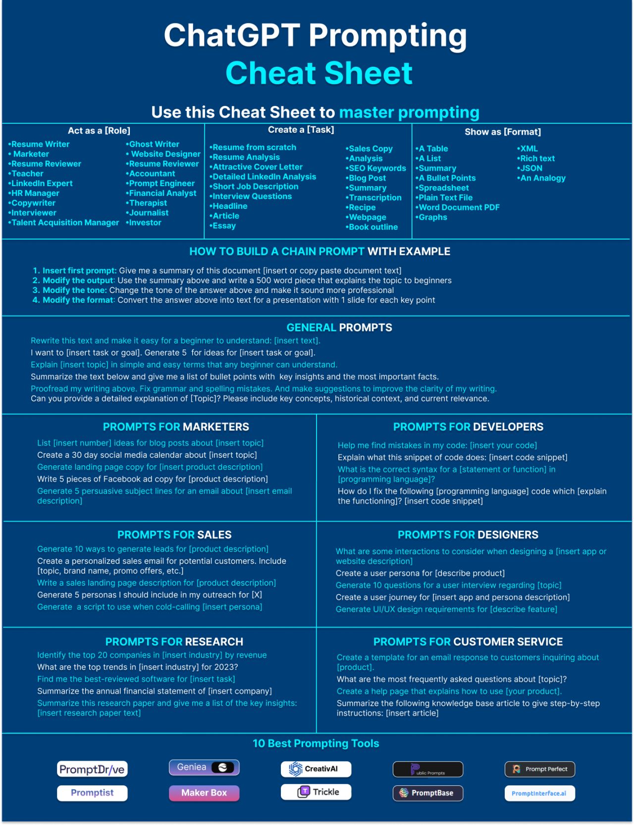
Prompt engineering is not the answer. For a command line interface, the range of possible inputs is near infinite. This is where the visibility problem for GenAI and LLMs becomes apparent: nothing is foreground, everything is background, with nothing to map intent onto. There is nothing to grab as a starting point.
Good design provides deliberate, considered, and intentional affordances that help people understand what is possible. The fact this “cheat sheet” exists is exemplary of the problem.

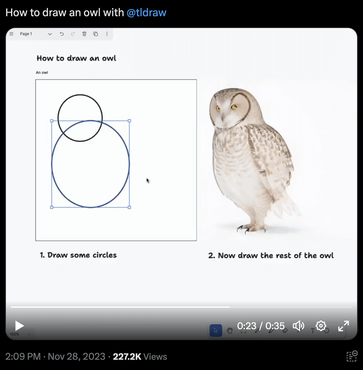
The strongest example of innovative interaction with GenAI comes from a free/open-source drawing canvas called tldraw. Experiments have been conducted on integrating GenAI models directly into the tool, whereby the elements you draw become inputs into the models. This kind of visual separation of the essential variables (be they graphic or text) allows for faster and more intuitive interaction with the models. It’s still trial and error to an extent, but at least the inputs are visible and easy to tweak. These tldraw experiments are true graphical interfaces for GenAI, in the most literal sense of the term.

For AI to meet its potential and solve meaningful problems, more investment needs to be made in providing ways for people to interface with these models and understand how their inputs directly influence and contribute to the outputs.
It’s more than learning how to write better prompts for the terminal. It’s about presenting the inputs and outputs with transparency and annotation so there is less brute force trial and error on the way to a meaningful result.
Without such investment, the era of aggregated caricatures of “people like you” will continue with “set it and forget it” predictions of what the model believes we want. If we’re lucky, we’ll get to say no or press skip. If we’re lucky.
I think we can do better.


